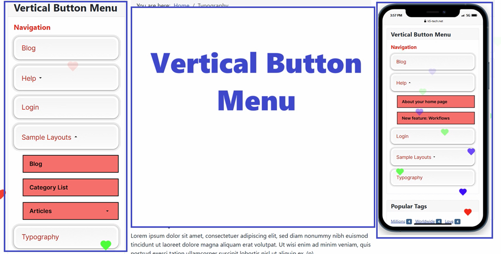
Joomla Vertical Menu Module Flex Extension you're describing is a highly flexible vertical menu modern design and responsive navigation tool tailored for both desktop and mobile experiences. It’s especially useful for developers and site owners who want full control over menu styling and behavior—without needing to write code.
✅Mobile-Friendly Features
-
Responsive on Mobile: Seamless view for mobile menu, making it easier to tap and navigate with its unique button design.
-
Show Menu on Mobile View Ensures the menu is visible and functional on mobile devices, with adaptive layout and touch-friendly interactions.
✅Styling & Appearance Controls (only on PRO version)
| Feature | Function |
|---|---|
| Custom CSS | Add your own styles to override default behavior or match your site’s theme. |
| Submenu Text Color | Set the color for dropdown or nested menu items. |
| Module Class Suffix | Append a custom class to the module for targeted styling via CSS. |
| Submenu Background Color | Define the background color for dropdowns or flyouts. |
| Sub Menu Border Color | Add borders to the main menu for visual separation. |
| Choose menu | Select which menu you wanted to disply on the frontend |
✅Menu Structure & Behavior
-
Menu Selection Choose which Joomla menu to display (e.g., Main Menu, Footer Menu, etc.).
-
Start Level / End Level Define which levels of the menu hierarchy to show.
-
Start Level: Where the menu begins (e.g., level 1 for top-level items).
-
End Level: Where the menu ends (e.g., level 2 to include submenus).
-
-
Show Sub-menu Items Toggle the visibility of child menu items—useful for dropdowns
- Animation effects when mouse hover
Vertical Button MENU for Joomla module is perfect for responsive websites, mobile-first designs, and custom-themed Joomla projects.